PHARMACY
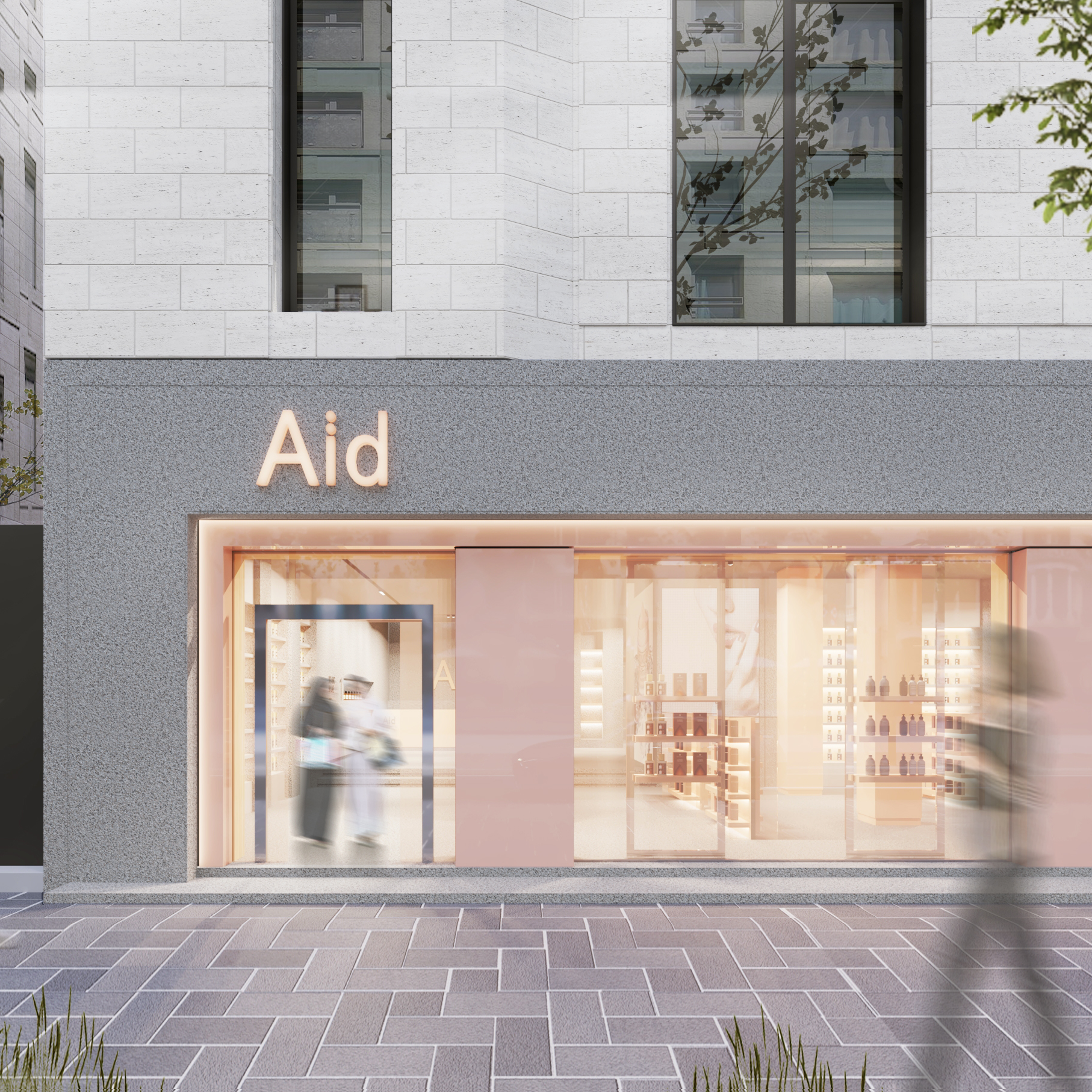
The color palette chosen is based on modern visual identity. The pastel pink and white tones make the interior a bright and dreamy place. With small accents of metallic silver color for the brand’s stand signs, the Interior design studio brings elegance to the interior and elevates the space. The marble on the floor and the display areas harmoniously fit in the interior, bonding all the elements in a unique and cohesive design. Glass and wood, pink and silver, all evoke a sweet but
not sticky-sweet feminine atmosphere.
One might think this will all lead to just too much pink, but this isn’t the kind of pink that drives us crazy. This is a warm peachy color, perhaps not even pink at all, in the end. Of course, the entire space is beautifully balanced by the almost entirely blank white upper section. The eye is not inundated with visual cues or nervous, redundant details.


